BLOG

Ok, so this is not a post about some design hack for storing your stuff….although I can help with that! ‘Keep it here’ is different.

There are so many things to cover here…..so many places to start and directions to go. Why? Because Diana Vreeland, that’s why. A traditional start when she is the topic is not possible.

A couple of days ago I posted this iconic carpet pattern on my Instagram feed as a little Halloween pop quiz. If you didn’t recognize it then, you certainly do in the shot above if you are a fan of THE SHINING , released in 1980 and sending shivers up spines ever since.

It’s Fall (wasn’t it just March!) and that always brings warmer, deeper color tones to match the leaves and pumpkins and rich light we see this time of year. I don’t know anyone that doesn’t love the cooler temps that make us crave butternut squash soup, bonfires and s’mores. I am a traditional girl in many respects, but the standard orange that is overused (imo) this time of year is just not doing it for me. I’m going with rich, deep feels this month and am ready to answer some of the W’s, but not in an expected order because, well, aubergine… What is Aubergine: Deeper than Plum, Eggplant, Blackberry Cobbler, Queen of the Night Tulips, Deborah Lippmann Truth to Power Nail PolishWhy is it inspiring right now: It’s comforting and warm (like grandma’s hug), but it’s also a fun challenge because it seems like it would be too bold to be versatile. But listen, aubergine plays so well with others. Don’t be intimidated. I can’t wait to show you all the ways you can utilize this color!!Where: I mean, my question with almost any color is “what do you mean, where?! Where would you not?” I think if you start to look, you’ll see that this color is more present than you realize.When: NOW, girl!Who: Listen, it’s for whoever wants to just do the thing. Need guidance? Follow along this month on my Instagram or call me! Don’t be scared (see grandma’s hug!).
The atmosphere in your bedroom is probably 50% of relaxing and getting the sleep you need. We’ll deep dive into the other half in this series, but for now I want to focus on what kind of room you are sleeping in.

Sleep is critical. We have to have it. It fuels our health, our mood (!!) and recharges us. When we are short on it, we are vulnerable to illness, cranky and basically walking around in a fog. Think about the last time you tried to get to the finish line of a workday when you had a rough night’s sleep. Ever said, “sorry, I didn’t meant that, I’m just tired”? Maybe treaded oh so very lightly around a toddler that missed a nap?
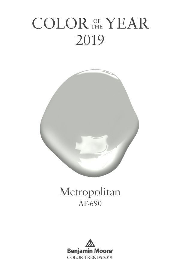
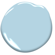
Recently I took a poll on Instagram asking if we were over the color gray. I was a little surprised at the results so, disclaimer: I might upset some of my people.
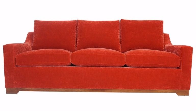
so·fa /ˈsōfə/ n . definition: a long upholstered seat with a back and arms, for two or more people
Leopard print has probably had more rises and falls than any other trend in print. It’s been considered high fashion all the way down to trashy and back again. At times a symbol of wealth and power, others a symbol of rebellion and even smut.